The Cancer Atlas
Visualizing data to make information accessible

Role
UX lead
Interaction design
Visual design
Narrative development
Infographic design
Highcharts customization
The Challenge
How do we surface the stories in data and make a topic such as cancer, accessible? How do we translate a data-heavy book into an interactive and engaging website that is both functional and tells the story of trends across data?
Solution
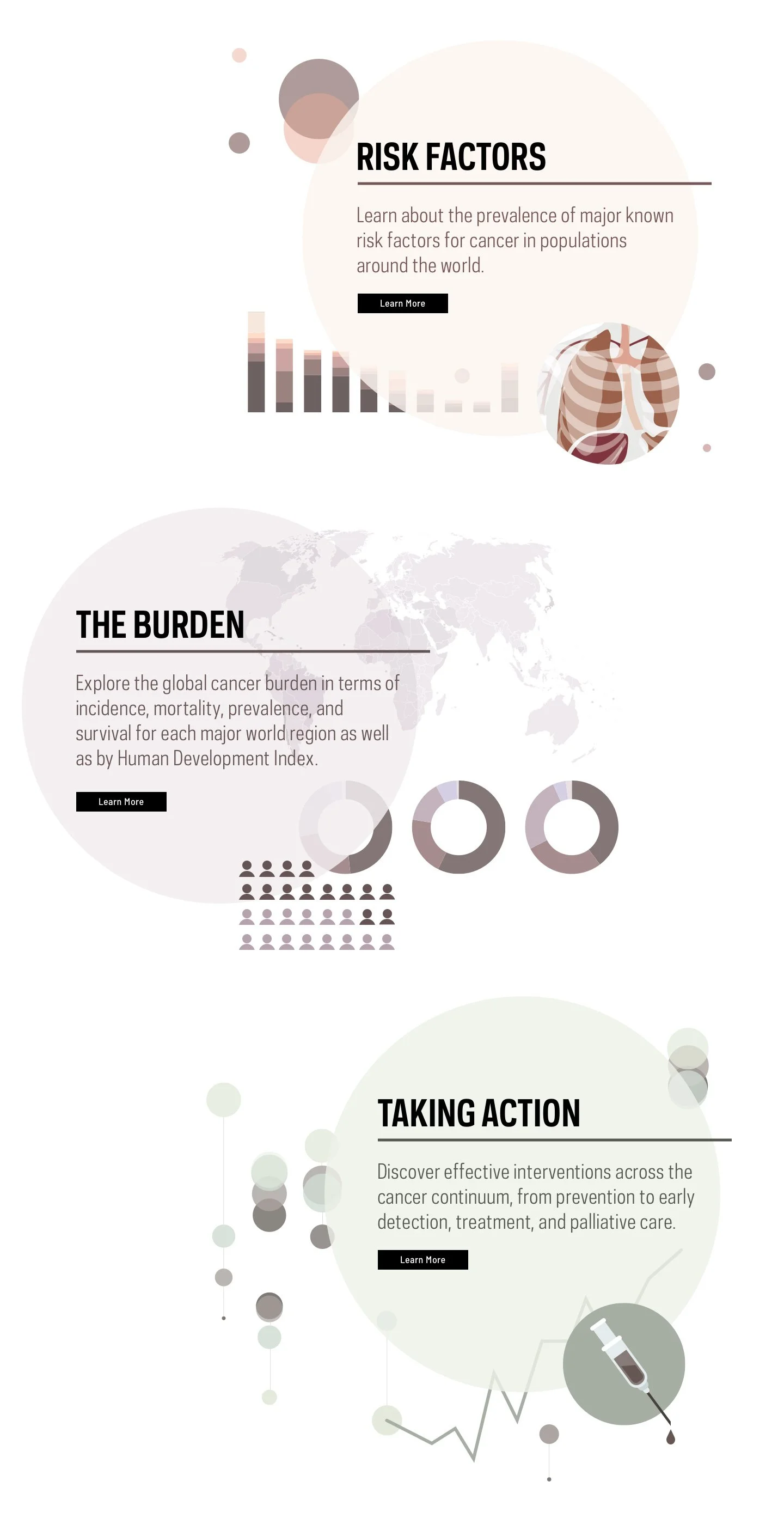
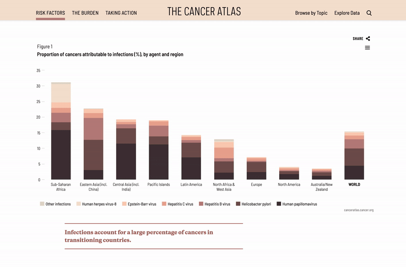
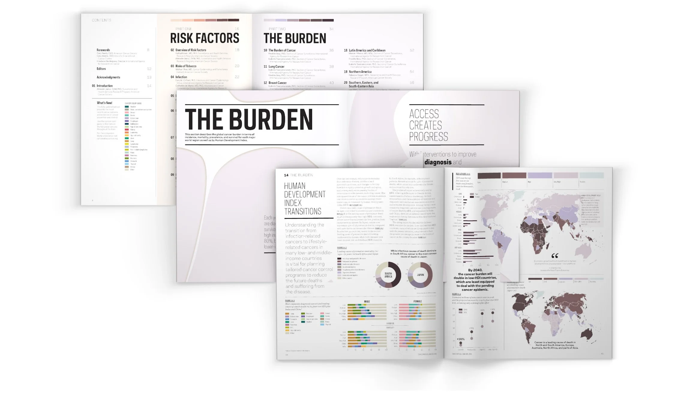
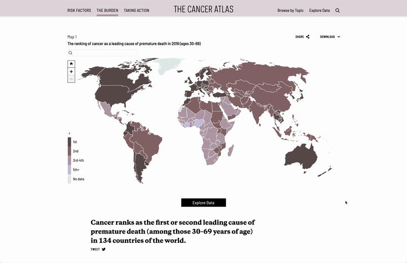
This was Language Dept.’s third engagement with The American Cancer Society. As UX lead for the newest edition of The Cancer Atlas, I led efforts in making the case for transforming the existing, static website into a narrative-rich digital platform that uses motion as a storytelling device, and makes the data more usable and accessible for downloads. The final website, canceratlas.cancer.org, features 125 data visualizations, 50 choropleth maps, and a color-coded visual system translated across a flagship book and companion website, featuring interactive data charts and a narrative homepage map tour.
Result
Data was downloaded by 69% of visitors.
A theme to unify the stories
"Access Creates Progress" became the unifying theme that emerged from project discovery, research, and stakeholder interviews. I collaborated with the researchers at The American Cancer Society (ACS) to bring this theme forward on the homepage with an interactive narrative map tour to highlight stories of positive change in 6 countries around the world. I guided the content strategy, storyboarded and designed the interface, and worked with developers on motion and animation.

Data for all platforms
I researched technology for the best solutions to create data visualizations that could be published in both print and web. After sourcing Highcharts, my team and I designed and customized with javascript, all 125 data visualizations to be imported into print spreads and embedded into the website as fully responsive and interactive charts.

A feature-rich website
Rather than a one-to-one translation from printed book to web, the companion website offers opportunities for engagement that includes moments of animation and movement throughout the website. I led UX and content strategy to reorganize and translate content into a digital platform, and designed and prototyped parallax animation for the 3 section landing pages.

Using color to key the data
Two parallel color systems—one keyed to the 3 top level sections of the site, and the other keyed to cancer colors—aid in the clarity of information across the sections, organization of content, and ease of navigation.