Whimsy & Spice
Creating—and rebranding—a Brooklyn food and lifestyle brand
Role
Creative direction
Branding
Web design
Product design
Package design
Photography & styling
Illustration
The Challenge
I was a Co-founder and Creative Director of a Brooklyn-based bakery from 2008 to 2020 with my pastry chef husband. With limited funds, we capitalized on the handmade movement and did all the design, marketing, product photography and fulfillment ourselves. Ten years into our business, trends and customer tastes were changing. We needed to refresh our branding to meet the challenges of a changing retail landscape and increased competition in our niche market.
Solution
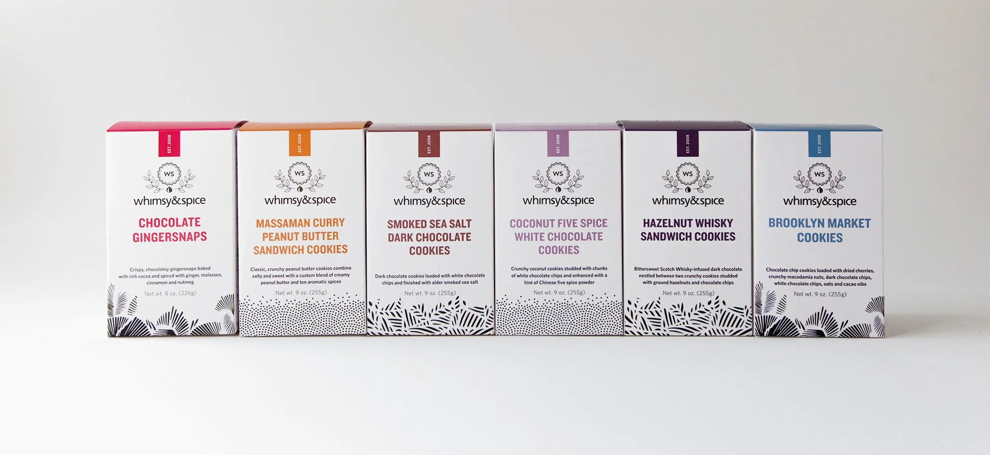
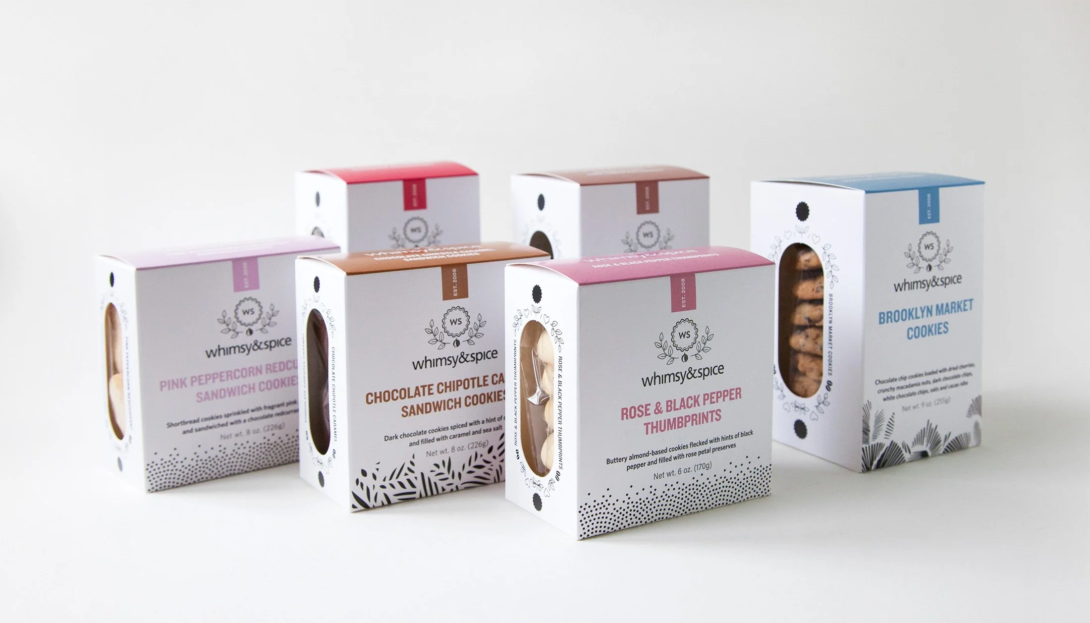
Redesigning our presentation from our humble cello packaging to beautifully printed boxes was a necessary business decision and investment. We needed to upgrade our shelf presence in retail stores, provide nutritional information on our packaging, and elevate our brand image to reflect current retail trends. The boxes were also a functional upgrade because they provided better protection from constant handling of product by customers in stores.
Result
Wholesale accounts and partnerships increased 20% after new package launch. We've been featured in press including The New York Times, The Wall Street Journal, New York Magazine, The Martha Stewart Show, Food & Wine, New York Magazine, Saveur, The Cooking Channel, and The Food Network.
A refreshed identity
To mark our 10th anniversary in 2018, I redesigned our logomark and introduced product iconography for use in market signage, packaging, and print materials.
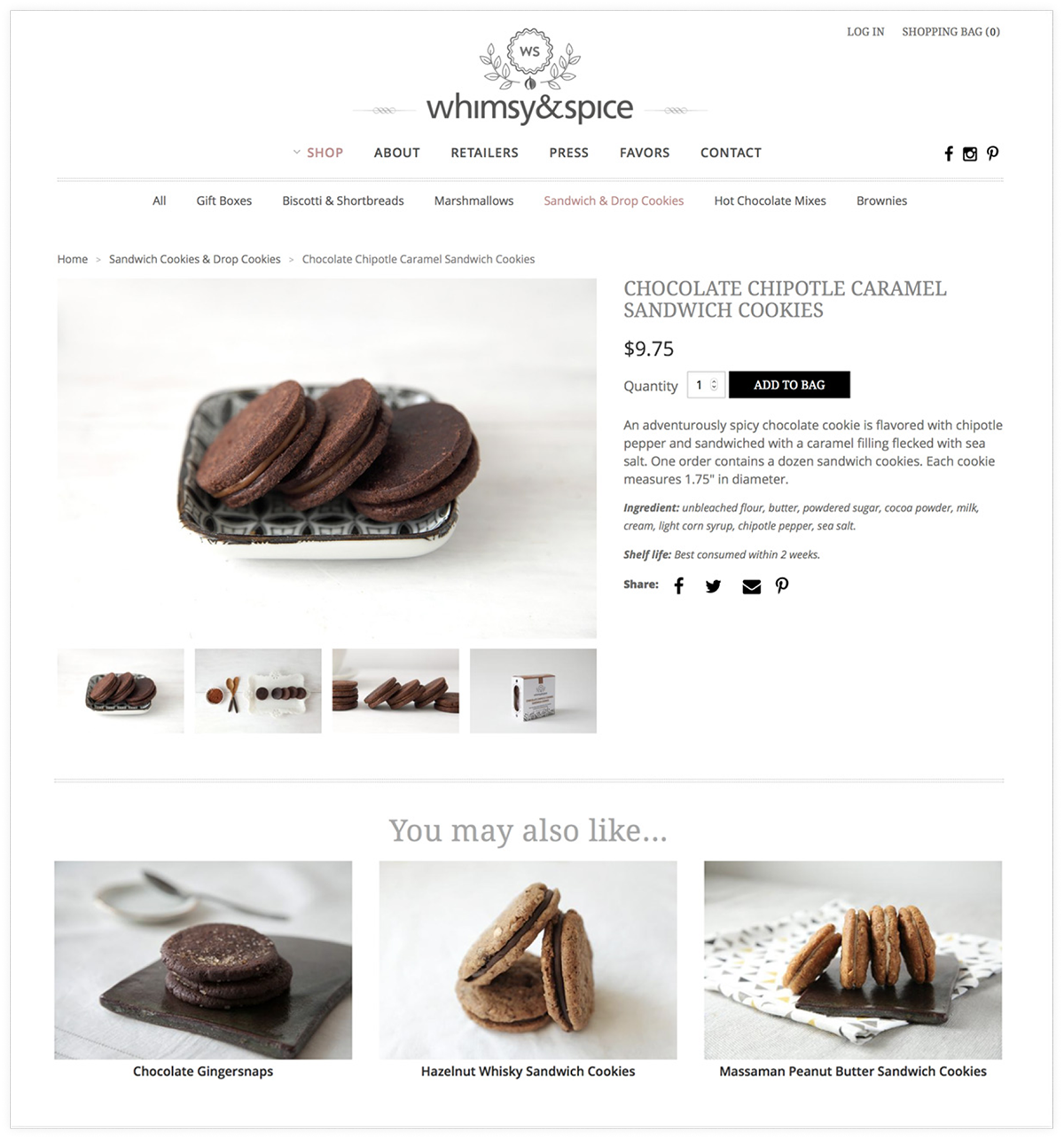
Our newly redesigned e-commerce site on Shopify features a custom design with greater focus on product imagery and cleaner navigation.
Elevating a brand image
I went through design explorations by drawing different patterns that expanded the visual language I was building using the iconography as a launching point. I then began exploring how they might be applied to cookie boxes. The final packaging elevates our brand image by moving away from the DIY sensibility that was on trend when we launched. The boxes showcase the cookies through a die-cut window, while the illustrations still preserve a "handmade" aesthetic. A new palette of 16 colors for each one of our cookie packages are unified by black and white patterns, type, and iconography.
Photography as the most important brand asset
I conceptualized, styled, and photographed all of our company's product photography and social media content, including seasonal recipes and holiday campaigns. Assets were then leveraged and shared across all social media platforms. By developing a unique photographic style, our brand photography was immediately recognizable by customers anywhere.
Iconography as pattern
An illustration designed entirely from our playful product iconography provides the base for branded imagery on tote bags, prints, and postcards.
Expanding the product line beyond food
Over the past 10 years, I have designed various paper goods and products for Whimsy & Spice including prints, kitchen tea towels and posters, illustrated botanical cards, and calendars featuring original photography.
Whimsy & Spice was one of the original food companies that grew out of the artisan food movement in Brooklyn, NY. We closed our business in June 2020.


